
Scientific research shows that the best bedroom colours for sleep go beyond aesthetic priorities. People with blue bedrooms sleep longer than those with other coloured rooms. This fascinating finding has solid scientific backing. Research demonstrates that specific colours trigger physical responses that affect your sleep’s quality.
Your bedroom’s calming colours can reduce heart rate and blood pressure. This creates an ideal environment for peaceful sleep. Light blue achieves a perfect sleep score of 10/10, while sage green ranks an impressive 9.5. The science suggests avoiding stimulating shades like red, orange and yellow. These warm colours can trigger negative emotions and increase your heart rate, making them poor choices for sleep. You’ll find what colours help you sleep best and why, based on scientific evidence rather than personal opinion.
The science behind calming bedroom colours
Your bedroom’s colour does more than just look good – it can make a real difference in how well you sleep. Research into colour psychology shows that specific colours trigger responses in our bodies that help or hurt our sleep quality.
What colours help you sleep, according to research
Studies consistently show that blue tops the list for better sleep. A Travelodge survey found that people with blue bedrooms slept the longest – 7 hours and 52 minutes each night. This makes sense because blue helps lower blood pressure and slows down both breathing and heart rate.
Green comes in as a close second, with people getting about 7 hours and 36 minutes of sleep. We feel more relaxed and comfortable around green because it connects us to nature. The natural world helps us feel grounded and brings a sense of calm to our busy lives.
Other colours that help you sleep better include:
- Light grey/silver – These peaceful, serene rooms helped people sleep 7 hours and 33 minutes on average
- Soft pink – This gentle blend of red’s energy and white’s purity creates a tranquil space
- Cream/beige – These warm, balanced tones help reduce stress
Research at the University of Sussex’s School of Psychology found dark blue to be “the world’s most relaxing colour”. This backs up what many interior designers have been saying about bedroom colours all along.
How colour psychology affects your sleep cycle
Your brain’s response to different colours shapes your behaviour and emotions. Special photoreceptors in your eyes pick up light wavelengths between 450 to 480 nanometers – which most people see as blue.
These receptors play a big role in producing melatonin, the hormone that controls your natural sleep-wake patterns. The colours you see before bed can either help or mess with your body’s sleep preparation.
Oxford University’s research showed dramatic differences in how coloured lights affect sleep timing. People fell asleep quickly (1-3 minutes) with green light, while blue light delayed sleep by 16-19 minutes. Blue light also caused stress hormones to spike much higher than other colours.
We get better sleep when colours make us feel peaceful and content. Light, muted tones often work best because they create these positive emotional responses. That’s why your bedroom’s colour scheme matters so much.
The National Sleep Foundation emphasises that your bedroom environment, including its colours, helps regulate your body’s natural sleep rhythm. Since mood affects sleep quality, picking colours that make you feel good creates the perfect environment for rest.
The best bedroom colours work their magic by helping you relax, reducing stress hormones, and letting your natural sleep cycle do its thing.
Best colours for sleep and why they work
Bedroom colours do more than just look good—they can help you sleep better through their effects on your body and mind. Studies show that certain shades help create the perfect environment for rest. Here’s a look at the best colours and the science behind their effectiveness.
1. Light blue – lowers heart rate
Light blue stands out as the best colour to help you sleep according to multiple studies. This peaceful shade reduces your heart rate and blood pressure naturally to create perfect sleeping conditions. A Travelodge study found that people with blue bedrooms slept the longest—7.53 hours each night without interruption.
Your eyes’ ganglion cells respond better to blue than any other colour and trigger melatonin production. Soft, muted tones that remind you of clear skies work best for bedroom walls. You might want to try Benjamin Moore “Clear Skies,” Farrow & Ball “Light Blue,” or Sherwin-Williams “Sleepy Blue”.
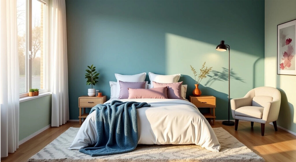
2. Sage green – brings nature indoors
Sage green ranks as the second-best colour to promote sleep because it connects strongly with nature. This gentle shade blends green with subtle grey undertones and creates a balanced, relaxing atmosphere.
The colour helps reduce anxiety by connecting with healing, harmony, and outdoor elements. Your retinas process green more easily than other colours, which means less eye strain after a long day.
Natural wood furniture, wicker elements, and houseplants enhance sage green’s calming qualities. Popular paint choices include Dunn-Edwards “Aloe Plant,” Behr “Soft Sage,” and Benjamin Moore “October Mist”.
3. Soft grey – neutral and grounding
Soft grey creates a sophisticated and peaceful environment that supports quality sleep. Light grey offers subtle warmth that feels both spacious and cosy, unlike stark white’s clinical feel.
Warm-toned greys work better than cold, steely versions. These warmer shades make small bedrooms look bigger while spreading natural light throughout the space.
Grey’s versatility allows many combinations: mix it with beige (“greige”) for warmth, sage green for an earthy feel, or blush pink for gentle charm. People who prefer clean, minimalist spaces that help clear their minds before sleep often choose grey bedrooms.
4. Blush pink – gentle and soothing
Soft pink tones might surprise you as top sleep-promoting colours. Muted blush shades have a calming effect, unlike energetic hot pinks. Research shows that while blue colours calm the mind, pink tones soothe the body—perfect for people who hold physical tension before bed.
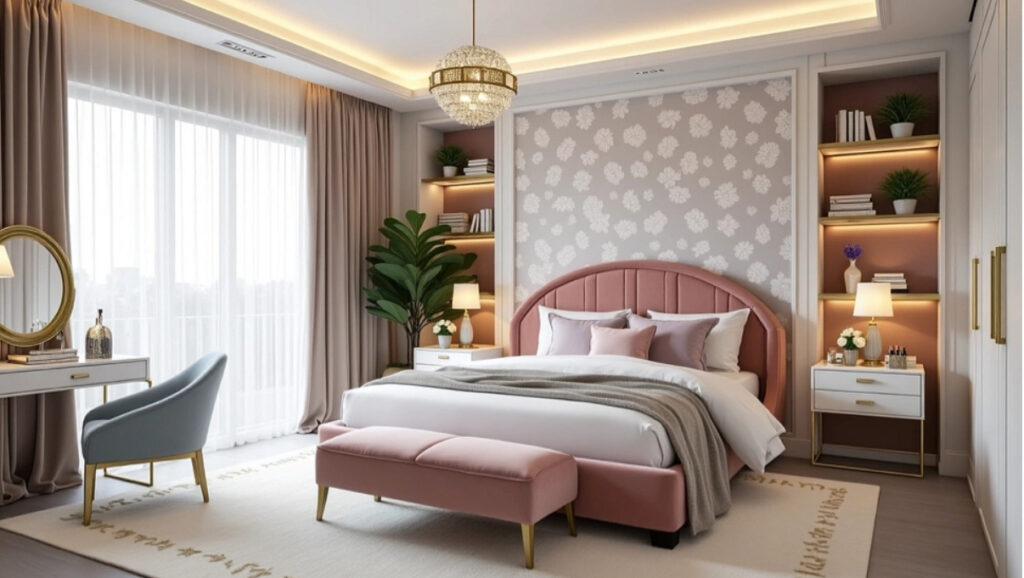
Soft pink creates a nurturing space that reduces stress levels. Dusty or muted rose tones work better than bright pinks. Try Farrow & Ball “Setting Plaster,” Behr “Pink Posy,” or Valspar “Rose Quartz”.
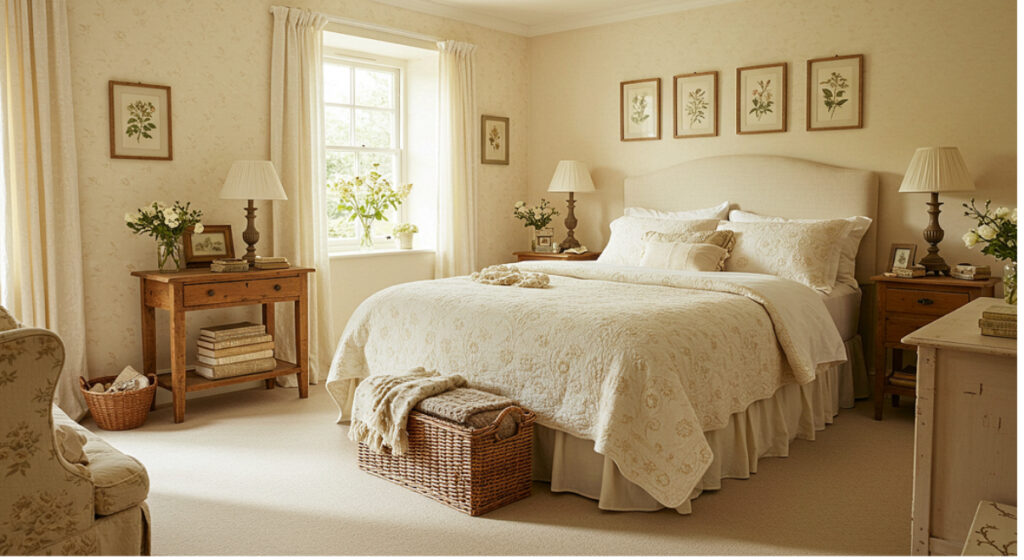
5. Cream – warm and balanced
Cream and off-white shades complete the list of top sleep-promoting colours. These neutral tones create a clean, comforting atmosphere without pure white’s harshness. They promote feelings of simplicity and peace.
Warm lighting enhances cream’s cosy qualities. This versatile shade works as a backdrop for any bedroom style and lets you add other sleep-friendly colours through accessories and bedding.
Cream’s simplicity helps create a clean visual space that reduces mental stimulation before sleep. Small bedrooms benefit from these shades since darker colours might feel too confining.
Worst colours for sleep and their effects
Some colours create the perfect sleep environment, while others can ruin your rest through their effects on body and mind. Studies show specific colours make you alert, agitated, and trigger negative emotions—exactly what you don’t want for quality sleep.
1. Red – increases alertness
Scientific evidence strongly suggests red is the worst colour for bedrooms. This bold shade makes your heart rate and blood pressure rise, creating conditions that fight against sleep. Research shows red increases brain activity and keeps you alert—the opposite of what you need before bed.
Studies have found that looking at red triggers a threat response in many people. Colour experts say “red can be overstimulating and not ideal for sleep-focused environments”. People link red with fear, anger, and excitement, along with stressful ideas like “panic,” “injury,” and “pain”.
2. Orange – too vibrant for rest
Orange carries many of red’s sleep-disrupting qualities. This energetic colour “stimulates both the body and mind” and “increases enthusiasm and excitement”. Orange puts your mind in a state that makes falling asleep difficult.
Colour experts point out that orange “raises the blood pressure, increases the heartbeat and muscle movement”. This makes it a poor choice for relaxing before sleep. The vibrant tone boosts creativity and mental activity, making it better suited for workspaces than bedrooms.
3. Black – can feel claustrophobic
Dark environments help you sleep, but black walls often create negative mental effects. Studies show black absorbs all light wavelengths and makes rooms feel smaller and more confined. This can make you feel trapped and restless.
People “strongly relate the colour black to negative emotions such as depression, sadness, anger, and fear”. These emotional connections can create discomfort that disrupts quality rest, even though black naturally links to darkness.
4. Bright purple – mentally stimulating
Bright purple makes the list of worst bedroom colours due to its red undertones that boost alertness. Studies show that “purple can be too stimulating for a bedroom, especially in its brighter and more saturated forms”.
This colour links strongly to creativity and imagination—mental activities that keep your mind active before sleep. Your brain activity and heart rate may increase with bright purple, making it harder to fall asleep.
5. Neon tones – cause sensory overload
Neon colours overwhelm your nervous system before bed with their visual intensity. These bright shades disrupt sleep because they overload your senses right when your brain needs to calm down.
Studies indicate that neon tones “can be too stimulating” and “interfere with melatonin production”, your body’s sleep hormone. This disrupts your natural sleep-wake cycle, making these intense colours a bad choice for bedrooms.
How to choose the right shade for your bedroom
The perfect bedroom shade goes beyond picking popular calming colours. A truly restful space needs thoughtful attention to your room’s unique characteristics and priorities. Even the most sleep-promoting colour might not work if you don’t implement it the right way.
Room size and lighting matter
Room dimensions shape how colours behave in a space. Lighter shades make smaller bedrooms feel spacious, while darker tones can make compact areas feel cramped. Larger rooms can handle deeper hues without feeling confined.
Light plays a vital role in how we perceive colour. The brightness of colours substantially affects our emotional responses—light blue feels happier than dark yellow, and soft green creates more positive feelings than deep forest tones. You can get the best results when you:
- Choose soft bedroom colours with warm, ambient lighting instead of harsh white bulbs
- Watch how your chosen shade changes between morning and evening light
- Note that white light can trick your brain into thinking it’s daytime and disrupt your circadian rhythm
Painting walls and ceiling in the same shade creates a brilliant cosy cocoon effect in bedrooms. This approach completely wraps you in the calming hue.
Your sleep habits should guide colour choice
Let your sleep challenges guide your bedroom colour scheme. Blues and greens might work best if you have racing thoughts since they lower blood pressure and heart rate. Blush pinks provide physically soothing properties for those who battle physical tension.
Your existing décor style can help arrange colours: light grey and white suit minimalist spaces, earthy greens and terracotta complement boho rooms, and light blue and grey accents enhance modern bedrooms.
Personal connection matters most. One person’s peaceful shade might energise another. Success lies in picking a shade from your favourite colour family that helps you feel relaxed and grounded.
Start small before big changes
Smart decorators start small before making dramatic changes. Try your chosen colour through accessories—pillows, throws or small furniture pieces—before you paint entire walls.
Wall colour testing should follow these steps:
- Paint large swatches (at least 1×1 foot) on multiple walls
- Look at these samples at different times of day
- Notice how each shade affects your emotions
This careful testing helps ensure your bedroom colour actually promotes relaxation rather than just looking good in theory. Time spent on this step prevents changes that might get pricey and ensures your bedroom becomes the sleep sanctuary you want.
Tips to enhance your sleep environment
Your bedroom’s sleep-inducing sanctuary needs more than just the right wall colour. Several environmental elements work together with your colour choice to help you sleep better.
Use warm lighting with calming colours
Light in your bedroom affects your circadian rhythm and melatonin production. Blue or harsh white light reduces this vital sleep hormone and makes falling asleep harder. Amber or red-toned evening lights work better because they don’t affect melatonin levels as much.
Warm white LED lights give off a soft glow similar to natural sunlight, which helps your body relax naturally. These lights work best with your bedroom’s calming colours. Dimmed lights boost the soothing effect of blues and greens while making cream and pink tones look better.
Keep decor minimal and clutter-free
Clutter creates stress and anxiety that gets in the way of good sleep. Studies show that messy spaces keep your brain active and make you feel like there’s too much work to be done.
The space under your bed is just as important – storing things there can make you feel stressed and affect your sleep. A minimalist approach works best. Keep only what you need visible and get proper storage solutions. This helps clear your mind before sleep and lets you rest properly.
 Pictured: Timberland wooden ottoman bed, priced from £299.
Add natural elements like plants
Some houseplants can make your sleep environment better. Snake plants and kentia palms store oxygen during daylight and release it at night, which makes your air cleaner while you sleep.
On top of that, plants like English ivy, Gerbera daisies, and spider plants look good and clean the air. Philodendron scandens needs little care if your room gets different amounts of natural light – just water it every few days.
Avoid screens and harsh lights before bed
British people spend about five hours each day looking at their phones, and many do this right before bed. Screen light wakes up your brain and reduces melatonin.
Take a 30-60 minute break from screens before you go to bed. You could try:
- Reading a physical book
- Journaling or meditation
- Listening to calming music or a podcast
- Taking a warm bath
These activities tell your body it’s time to sleep and create perfect conditions for rest.
Conclusion
Science proves that your bedroom’s colour affects your sleep quality through psychological and physiological mechanisms. Light blue emerges as the clear winner to improve sleep. It lowers heart rate and blood pressure while creating an ideal environment for your mind to relax. Sage green, soft grey, blush pink and cream are close contenders. Each of these colours brings unique benefits that lead to better rest.
Bright colours like red and orange work against getting good sleep. These energetic shades increase alertness and heart rate—exactly what you should avoid at bedtime. The right shade selection is a vital investment in your sleep health.
Scientific findings are important, but personal priorities matter too. Your perfect sleep colour should strike a chord with you and work well with your space limitations. Lighter shades work best in small rooms. Larger spaces can handle deeper tones without feeling cramped.
Your complete sleep environment needs attention beyond wall colour. Warm lighting enhances calming colours and supports natural melatonin production. Clean, organised spaces reduce mental stimulation. Some houseplants can purify your bedroom’s air as you sleep.
Of course, the perfect bedroom colour won’t fix all sleep issues by itself. But combining it with good sleep habits—especially when you have to limit screen time before bed—creates ideal conditions for quality rest. Your bedroom should be your personal sanctuary that supports the restorative sleep your body needs.
Take your time to sample different shades before making a final choice. The best bedroom colour ended up being one that helps you drift off peacefully each night, backed by solid science rather than passing trends.


